We live in the age of data. From global temperatures to shopping habits, new technologies have made it easier to collect, store and access information than at any other time in history. However, our use of these technologies has also eroded our attention spans and fuelled ‘post-truth’ misunderstandings.
So how do we present evidence in ways that the human mind can rapidly and accurately absorb it? Professionals who study data visualisation frequently come up with ingenious solutions. Here are nine iconic examples of data visualisation, as well as a more in-depth explanation of what data visualisation is, why it’s important and tips for improving your data visualisation skills.
What is data visualisation?
Data visualisation is the graphical representation of information and data. By using data visualisation elements, such as charts, graphs and maps, data visualisation can help make data more accessible and easier to understand. It can also help data analysts and others identify important trends, outliers and patterns in data, which can be leveraged to make important business decisions.
Data visualisation essentially makes data easier for our minds to process. It helps simplify massive amounts of information and is a critical piece of the puzzle when working with data of every type.
What are the benefits and advantages of good data visualisation?
Good data visualisation for organisations is essential for two very important reasons.
Storytelling with a purpose
People are visual creatures. Not only that, we appreciate a good story. In fact, humans are 22 times more likely to remember stories than facts. [1]
For this reason, data visualisation is critically important. Our eyes are drawn to colours and patterns. The colours and patterns presented in data visualisation serve to grab and hold the interest of those who observe them, ensuring that they absorb the message contained. In addition, data visualisation helps to bring the story of the data to life, ensuring that it’s more interesting and memorable.
Making sense of complex data
Every year, the amount and complexity of data continues to increase. In fact, by 2025, there’ll be more than 200 zettabytes of data in cloud storage around the world. [2]
This means that trillions of rows of data are generated every single day, and increasingly, people who aren’t trained in data science are unable to understand the meaning and significance of that data.
Data visualisation addresses this situation and brings a delicate balance between form and function when it comes to data storytelling. Examples of good data visualisation combine effective, eye-catching techniques with the ability to highlight the most critical parts of a data story and use that to inspire action.
Tools and tips for data visualisation
Data visualisation is a critical skill for any professional in a data science or data analytics-related field. To learn this important skill, aspiring professionals should follow these tips and endeavour to use the tools listed below:
Find a niche
Although data visualisation feels like a niche in itself, it has many specialisations. For example, some professionals create data art, whereas others focus on dashboards.
Choosing a niche enables you to focus and become highly proficient in a certain area.
Learn best practices
Data science and art are two very different disciplines, yet data visualisation effectively combines both. While the data may be accurate, when it comes to visualisations, beauty is in the eye of the beholder. So when creating data visualisations, be sure to learn best practices.
You can do this through research and by keeping up to date with industry trends.
Practice makes perfect
When creating exquisite and informative data visualisations, practice really does make perfect. By creating as many visuals as possible and testing them on your audience, you’ll be able to hone your craft.
Start small by recreating something else someone else has done, and then work your way up through more complex projects.
Data visualisation tools
Fortunately, many tools are available to help data professionals create stunning data visualisations. These include the following:
- Google Charts
- Tableau Grafana
- Chartist
- Infogram
Data visualisation examples
Ultimately, what do good data visualisations look like? Here are nine data visualisation examples.
1. Napoleon’s invasion of Russia
It’s no flashy infographic, but many information scientists consider this 150-year-old squiggle to be the best data visualisation ever created. Drawn by Charles Joseph Minard in 1869, it tells the story of Napoleon’s ill-fated 1812 invasion of Russia. [3]
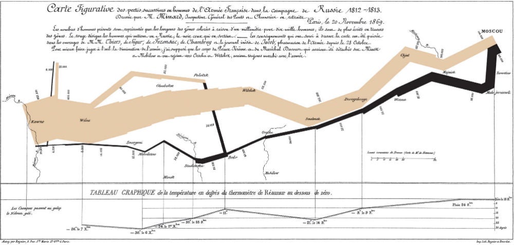
As the band moves left to right (in beige), then back again (in black), its dwindling width represents the loss of Napoleon’s troops to combat, starvation and exposure. Some 680,000 individuals left France for the campaign. [4] The thin black streak shows how few survived.
The brutal elegance of this graphic communicates the horror of this tragedy more viscerally than numbers ever could. It also shows us distance, latitude, longitude, direction, geography and temperature (if you can read French).
2. Global wind map
Sometimes a data set is so massive it’s difficult to imagine how it could be visualised. In a live, animated graphic of the world’s wind currents, designers Fernanda Viégas and Martin Wattenberg do this not just effectively, but beautifully. The exquisite interactive map demonstrates that data visualisation is a blend of science and art.
3. Syrian war factions
Data visualisation is a great way to make confusing networks of relationships digestible. This guide to the Syrian war from Slate clearly explains the complex alliances and enmities between the major factions. The interactive graphic is also a starting point for readers seeking deeper information.
4. Supplementary evidence
Another example of data visualisation is from the team at Information Is Beautiful. This interactive graphic of alternative medicine supplements compares the level of scientific evidence behind each one. The size of each balloon represents the popularity of each remedy, and where it floats signifies the extent to which it’s been proven to work.
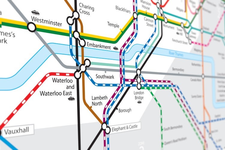
5. Tube map
If this 1931 map of the London Underground looks familiar, it’s because train maps in most cities of the world borrow from this design. The geographically accurate railway maps that came before it was sprawling tangles that left commuters hopelessly confused. A technological draftsman named Harry Beck realised that depicting London to scale got in the way of the real goal: communicating a complex system in an understandable way. Beck drew the map in his spare time. Its efficiency and clever use of colour were revolutionary.
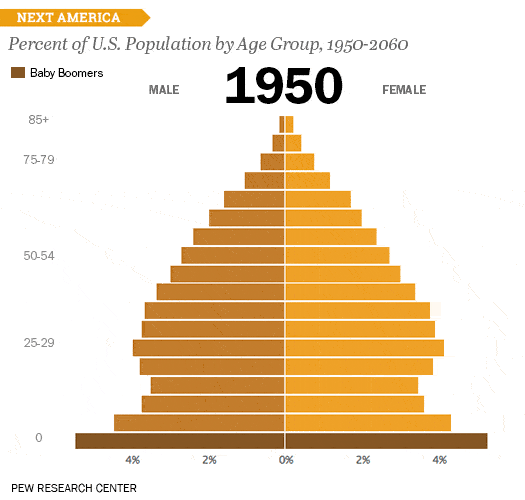
6. Baby boomer bulge
This nifty animated ‘age pyramid’ from Pew Research effectively depicts the ageing of the US population over recent and coming decades. By presenting their findings in a simple, intuitive GIF, Pew transforms seemingly dry demographic statistics into a startling story of a changing world.
7. US wealth distribution
Video allows data to be presented in dynamic and impactful ways. This animated clip on YouTube depicts the contrast between perceived and actual wealth inequality in the US with powerful metaphors and changing visualisations.
8. Flight radar 24
The Flight Radar 24 live air tracker shows the shifting locations of all the world’s aircraft currently in flight. With its simple yellow plane icons, this data visualisation couldn’t be much clearer – or cooler.
9. Picturing a zettabyte
As mentioned, by 2025, more than 200 zettabytes of data in cloud storage will exist around the world. What exactly is a zettabyte, and how much data is it, really?
Simply stated, one zettabyte is equivalent to sextillion bytes. However, this statement doesn’t clarify much. Fortunately, this zettabyte infographic from IT company Cisco has created a handy example of data visualisation to help people understand exactly how much it really is.
Become a data science professional
If you are professionally interested in data visualisation, postgraduate education can help you build the necessary technical skills and knowledge for success. JCU Online’s Master of Data Science can help you gain the expertise you need for roles in this exciting field. Find out more by speaking to our Enrolment Advisors on 1300 535 919 or email learn@online.jcu.edu.au.
Sources
[1] Anecdote: The Science of Storytelling
[2] CyberCrime Magazine: The World Will Store 200 Zettabytes of Data by 2025
[3] PBT Group: Emerging Trends: Graph Analytics
[4] ER Services: History of Western Civilization II: Invasion of Russia
Find out more about JCU’s online Master of Data Science.
Get in touch with our Enrolment team on 1300 535 919
